Development Nous
A confident identity for a multi-disciplinary development company.
Development Nous works across large-scale land development projects, with a focus on long-term thinking and well considered outcomes.
The brand needed to carry that sense of experience, but without feeling corporate or overly polished.
The result is confident and clear, using bold forms and a strong colour system, supported by a layout that keeps everything consistent across print, digital and signage.
SERVICES
Branding
Print collateral
Social media
Signage
Creative direction
CLIENT FEEDBACK
“Kylie quickly got to grips with how we operate and the technical nature of the industry, then translated that understanding into a brand that feels precise, confident, and genuinely aligned with what we do. A great example is the triangle element in our new logo – a smart nod to surveying fundamentals that instantly connects our visual identity to the accuracy and detail our work demands.
From initial briefing through to rollout, the process was smooth, collaborative, and highly professional.


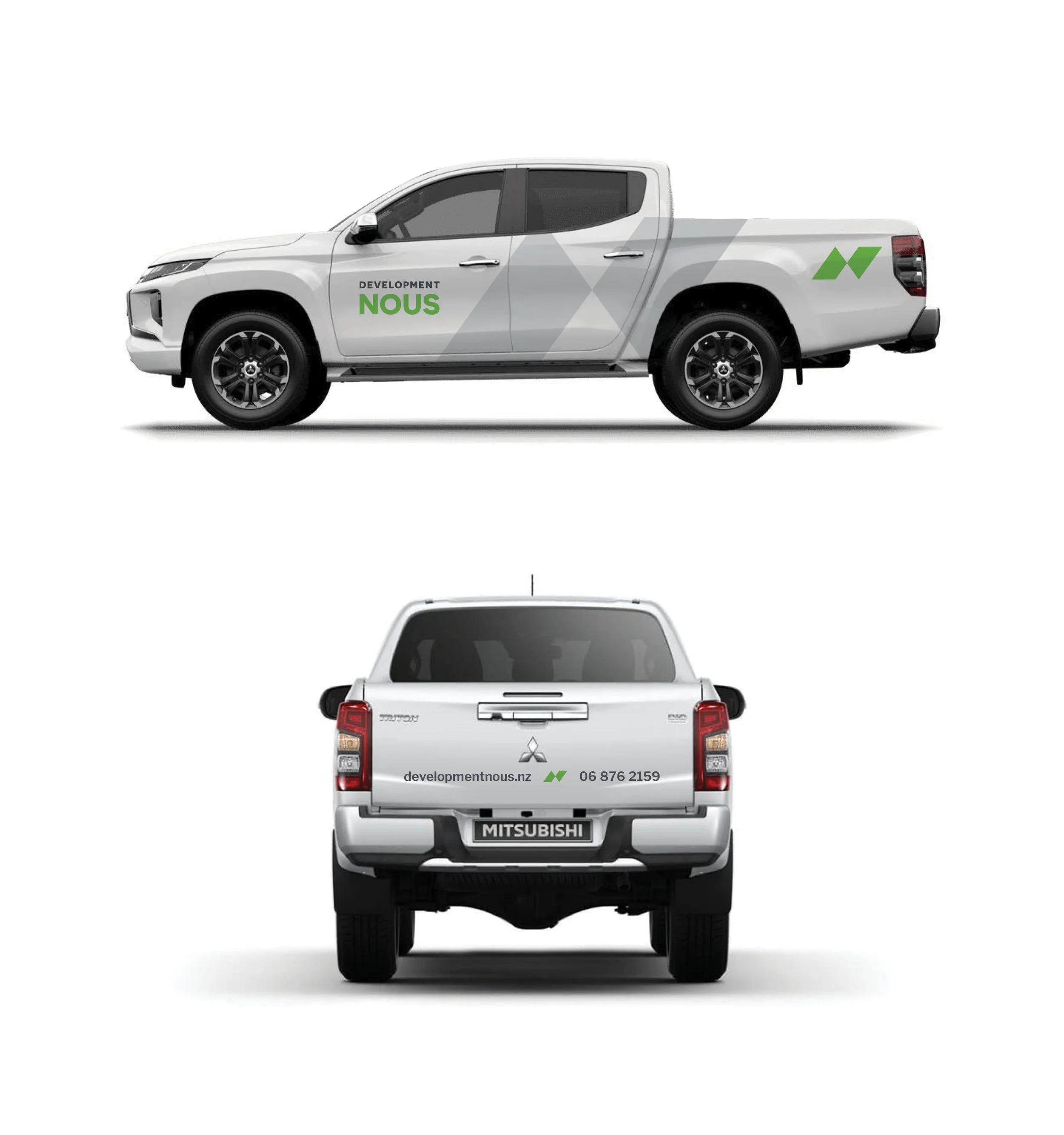
“Seeing the refreshed logo roll out across our vehicle fleet has been a real turning point for our presence on site and around the community.
The new branding gives our vehicles a clean, modern, highly professional look and has noticeably lifted our visibility across Hawke's Bay.”
DEVELOPMENT NOUS

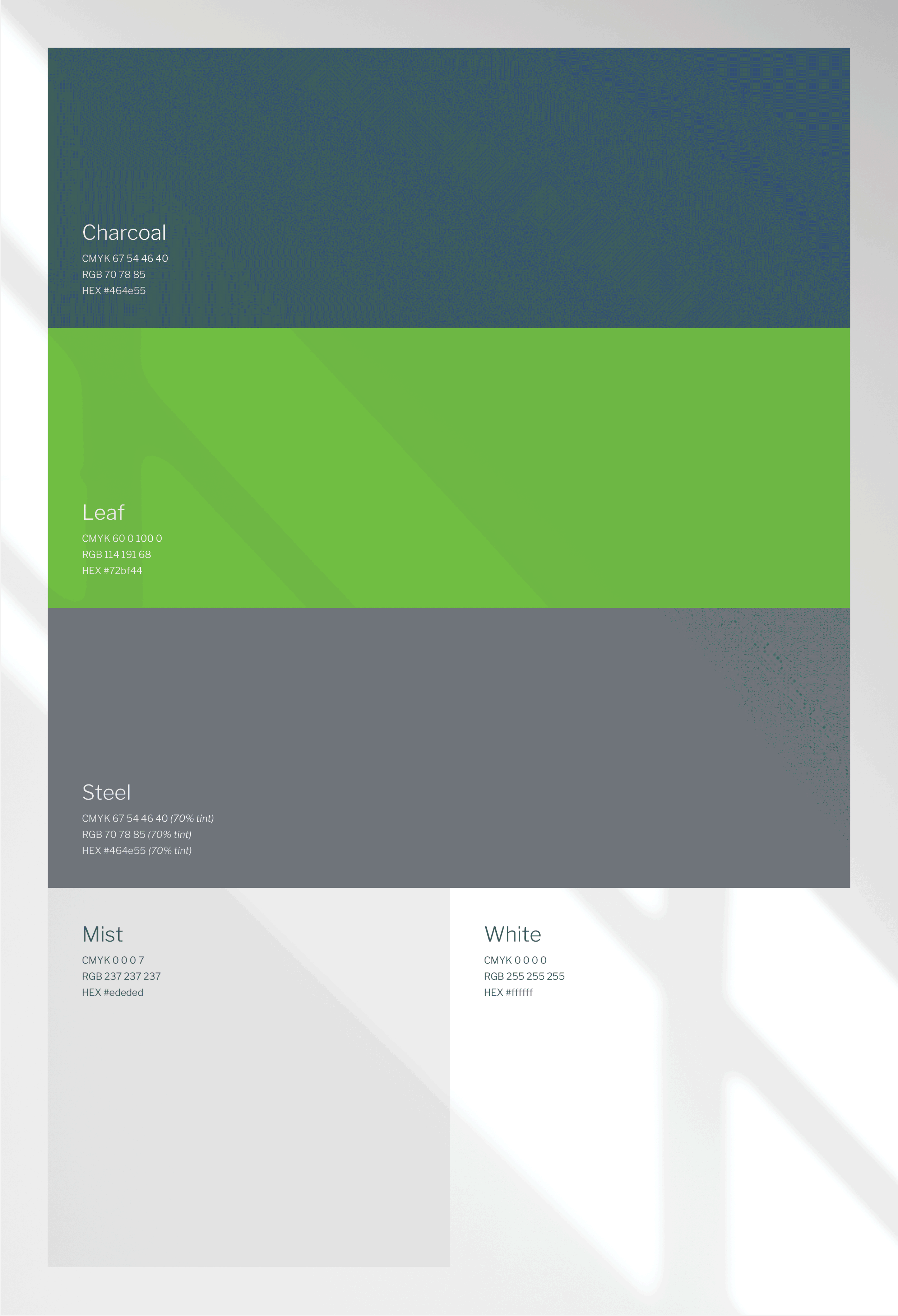
“Ponder also delivered a robust primary and secondary colour palette that works seamlessly across digital, print, and on-site applications. The primary colours give the brand strength and clarity, while the secondary palette adds flexibility and depth, so everything from proposals to site signage now feels cohesive and distinctly us”
DEVELOPMENT NOUS
